Bob’s AR Shopping Experience
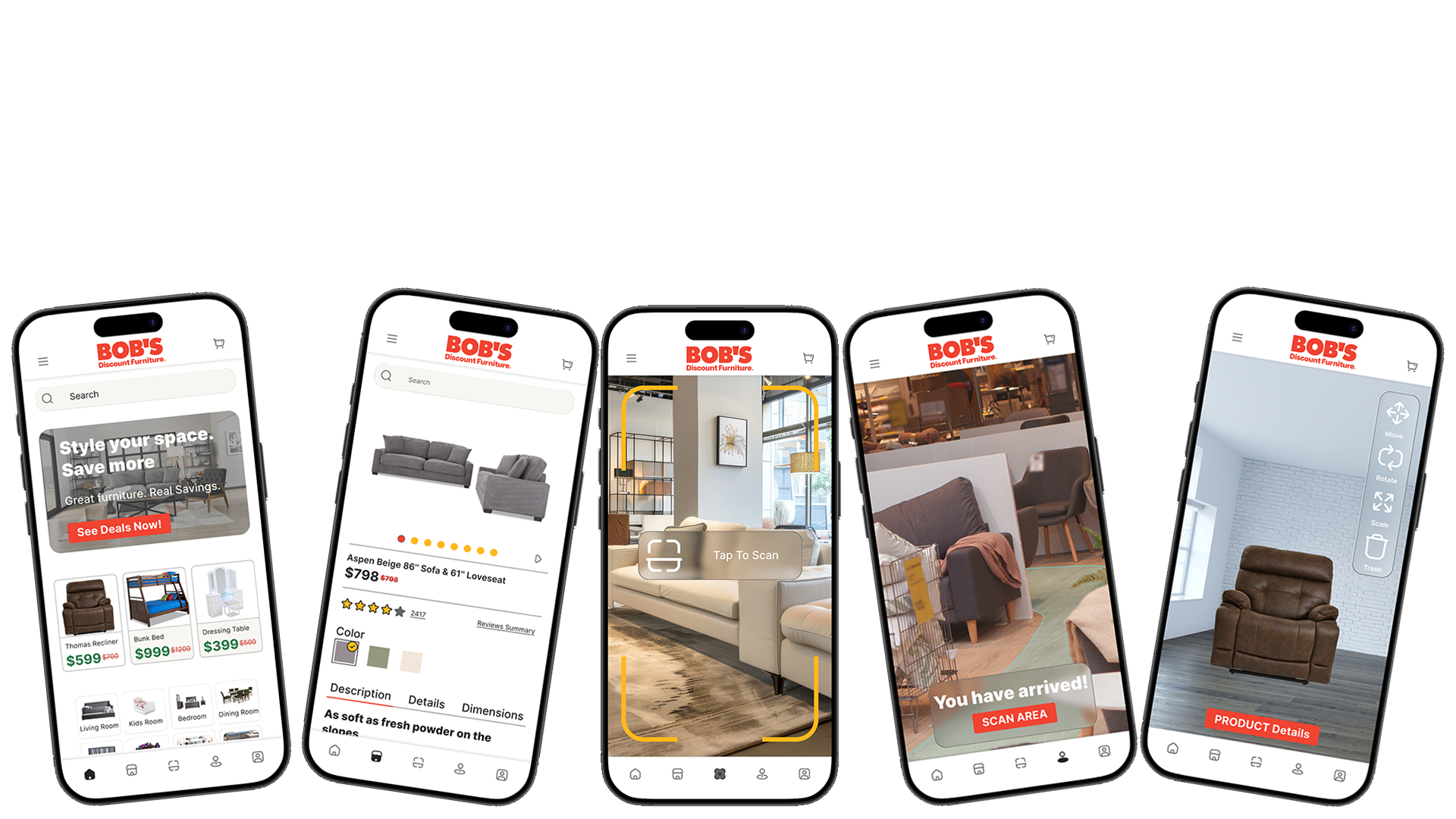
Bridging digital product discovery with the physical retail experience through augmented reality.
A UX Case Study by William Kinrade III
Role: UX/UI Designer
Project Type: Mobile AR Shopping Experience
Platform: iOS
Tools: Figma, Adobe Creative Cloud, Stark
Responsibilities: UX Research, Information Architecture, Interaction Design, UI Design, Prototyping, Accessibility
Timeline: 4 Weeks
The Project
Furniture shopping rarely happens in a single place. Customers may discover a product online, visit a showroom to experience it in person, compare specifications and reviews on their phone, and still return home wondering whether the piece will actually work in their space. Each transition introduces another opportunity for uncertainty or friction.
This project explores an augmented reality shopping experience for Bob’s Discount Furniture designed to connect those moments into a more continuous customer journey. Rather than treating AR as a standalone novelty, the experience integrates it directly into familiar shopping tasks. Customers can browse products, access detailed product information, recognize furniture within the showroom, navigate to products in-store, and visualize furniture at scale within their own environment.
The goal was to create an experience that complements the physical showroom rather than attempting to replace it. Traditional mobile UI provides familiar tools for browsing and evaluating products, while AR becomes available when spatial or environmental information can provide additional value. Together, these interactions create a bridge between discovering a product, understanding it, finding it, and imagining it at home.
Reimagining the furniture shopping journey by connecting the showroom, the mobile experience, and the customer’s own space.
Discover
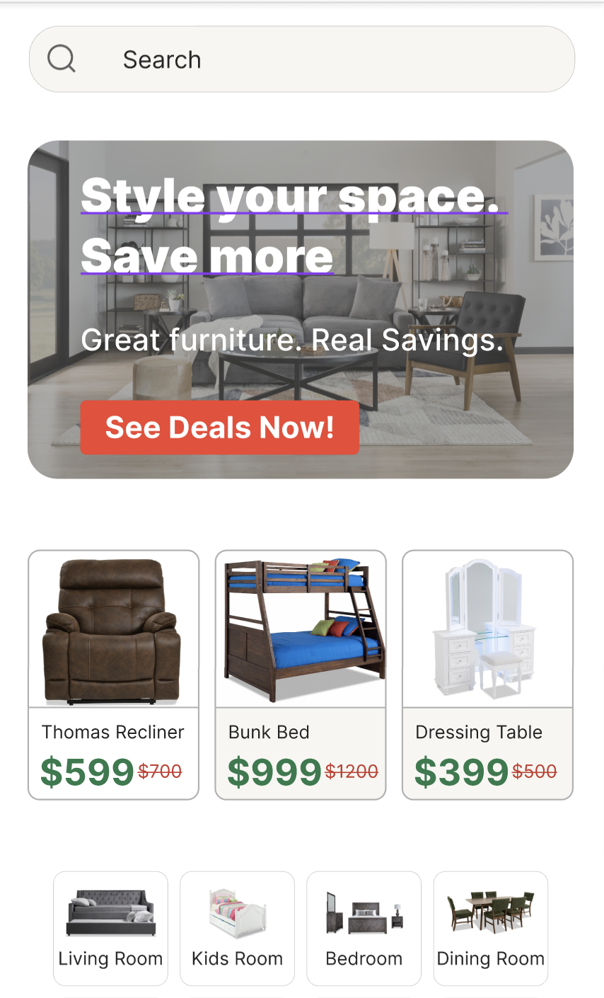
Browse products and categories through a familiar mobile shopping interface.
Evaluate
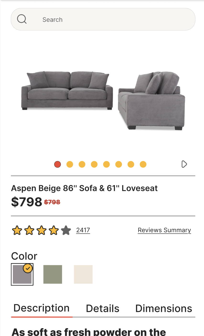
Review pricing, ratings, specifications, colors, dimensions, and product details.
Recognize
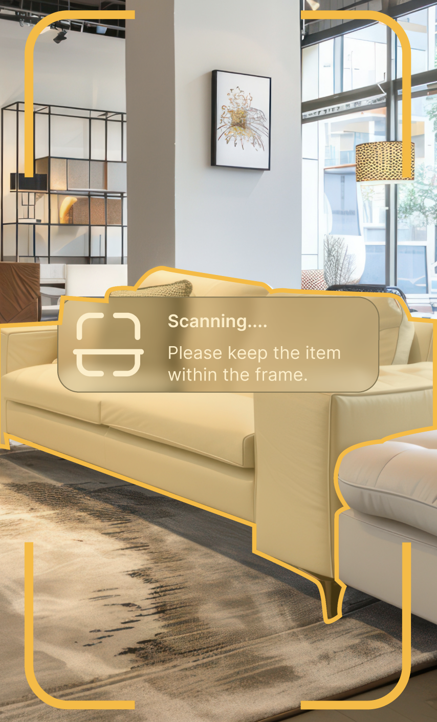
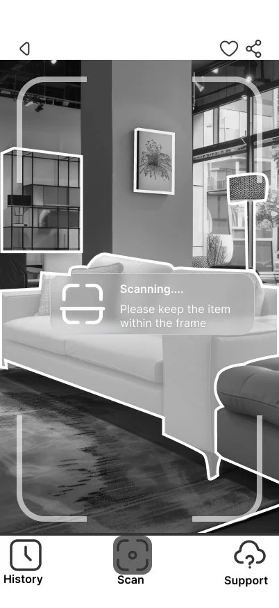
Scan furniture in the showroom to immediately identify products and access information.
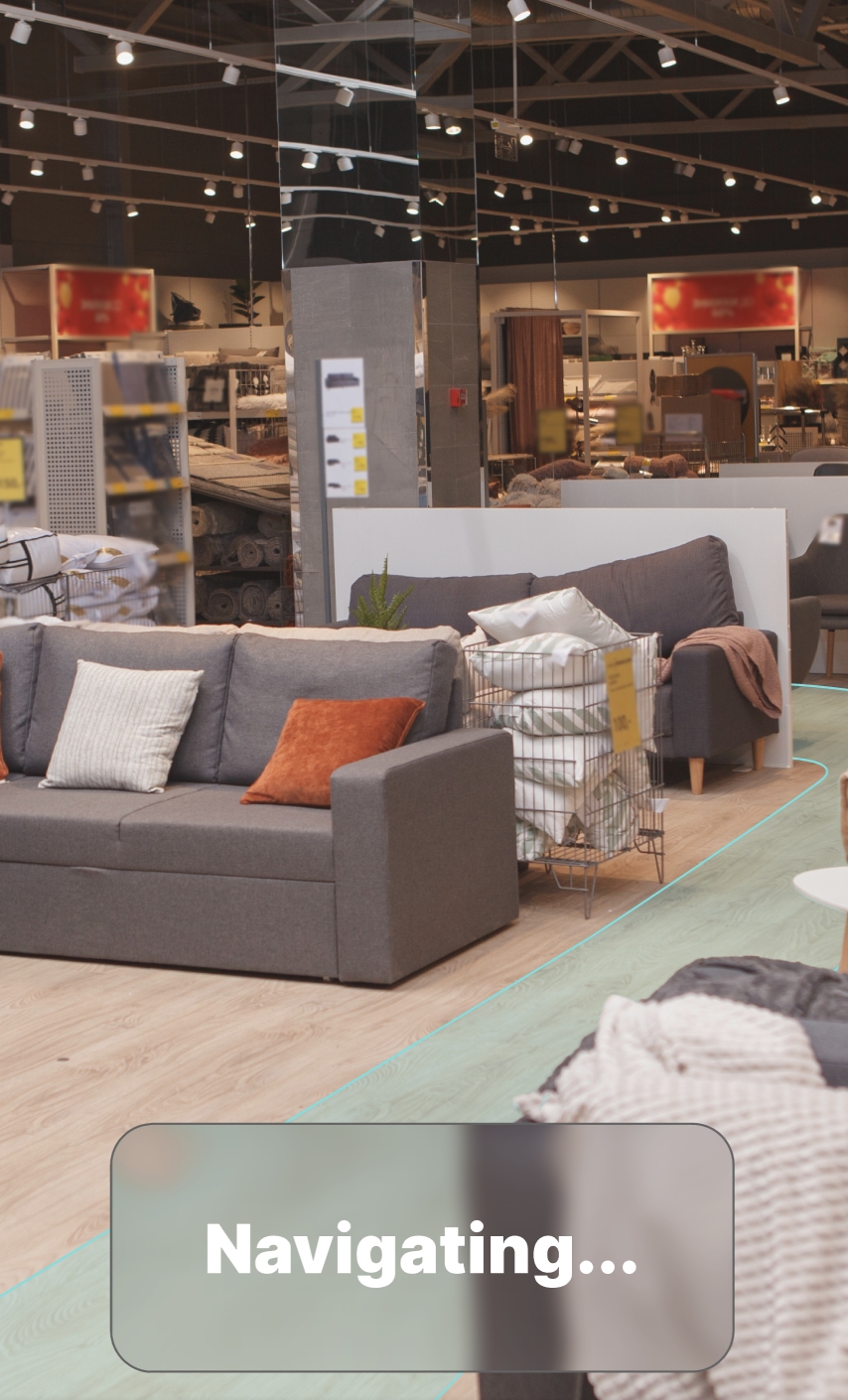
Navigate
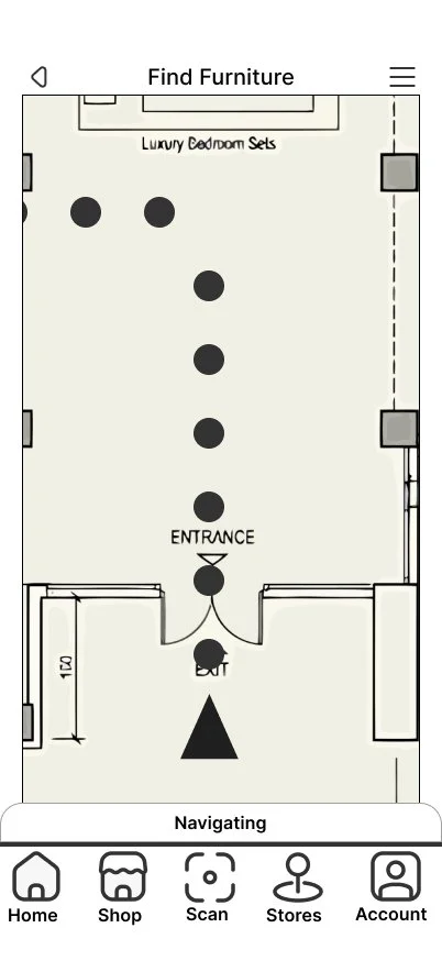
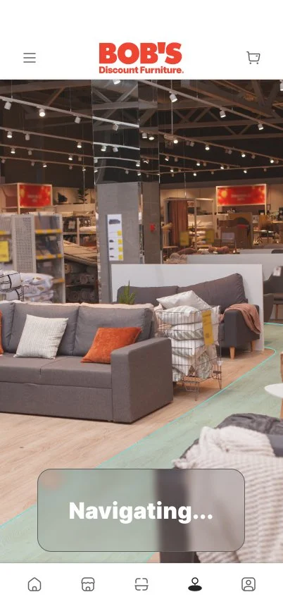
Use AR-assisted navigation to locate products within the physical store.
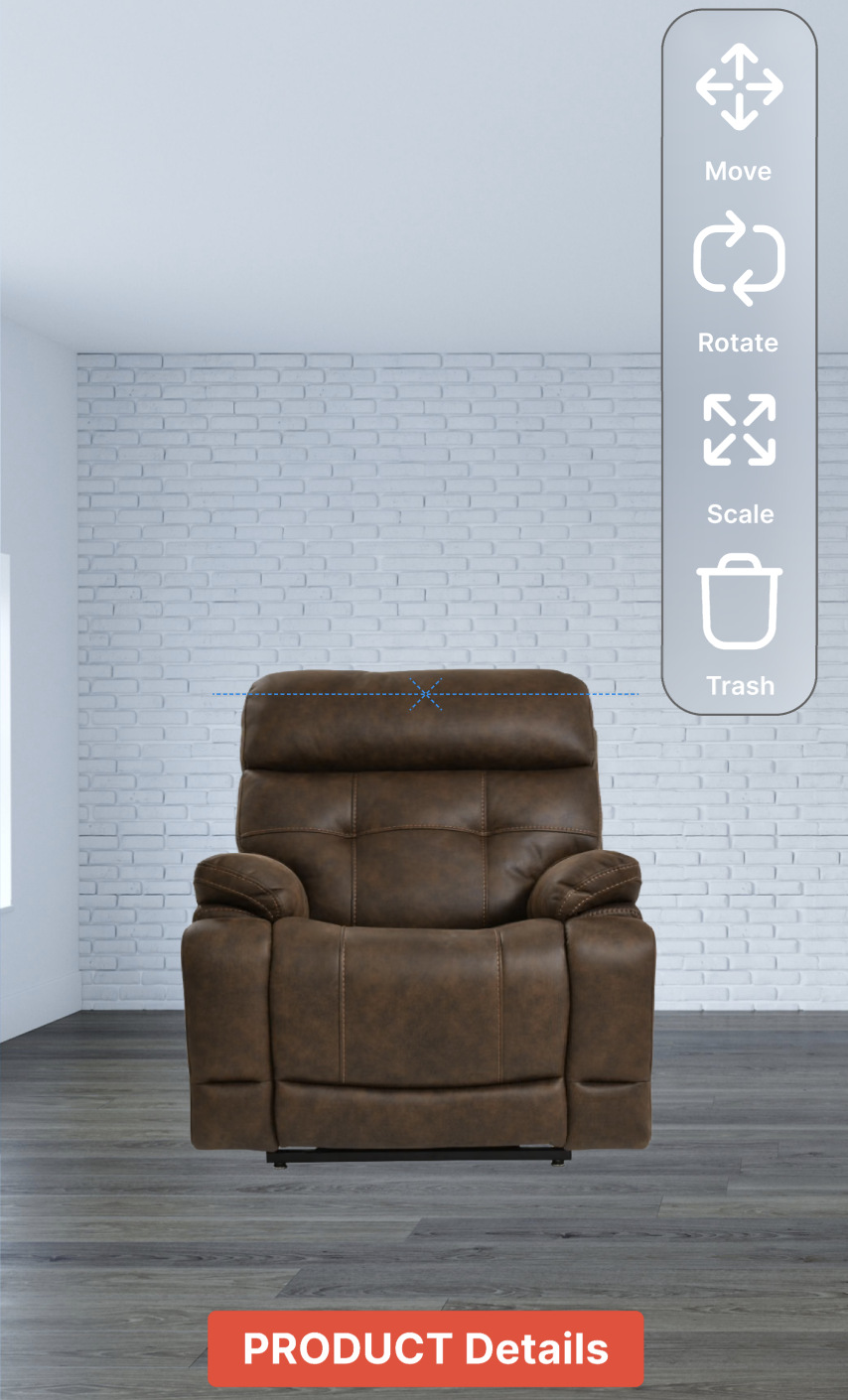
Visualize
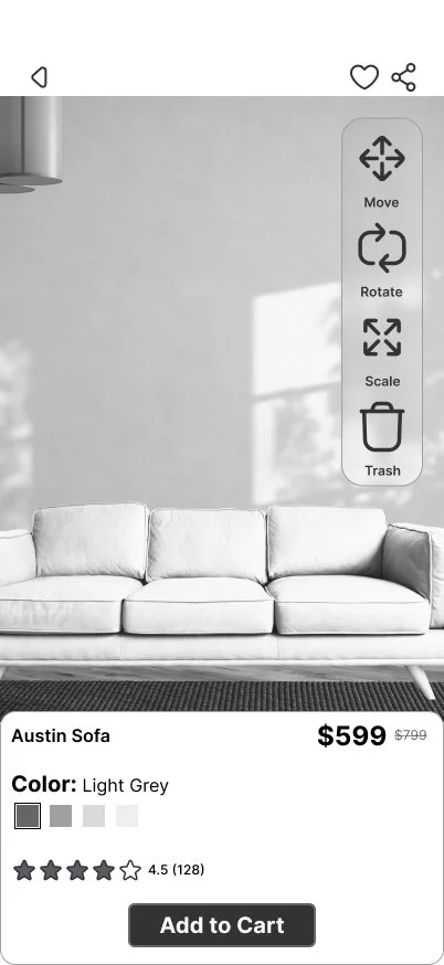
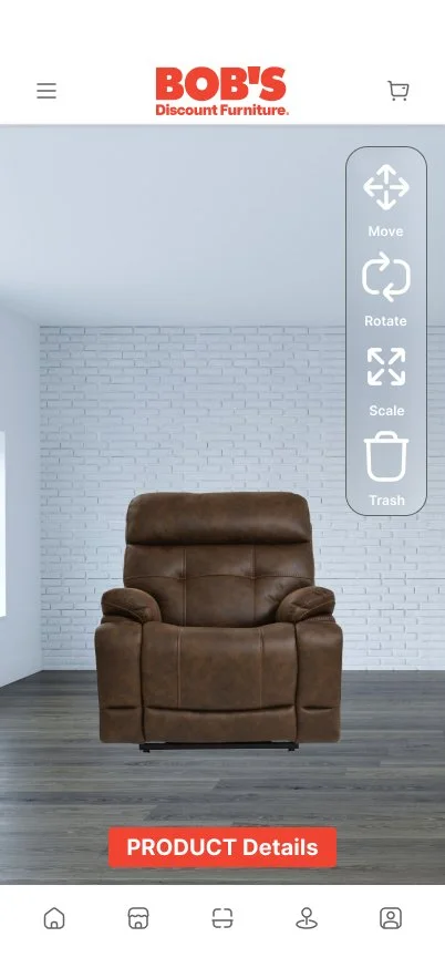
Place, move, rotate, and scale furniture within the customer’s own environment.
The Problem
Furniture shopping creates a unique gap between seeing a product and understanding how that product will actually work in a space. Product photography, dimensions, reviews, and showroom displays provide valuable information, but customers still have to mentally translate that information into their own environment. Size, scale, color, placement, and compatibility with existing furniture can be difficult to judge until a product is already in the home.
The physical showroom introduces another challenge. Large furniture stores contain hundreds of products spread across departments and staged displays. A customer who discovers an item online may still need to locate it in-store, while someone who encounters a product on the showroom floor may need to search manually for its name, specifications, reviews, or available options.
These experiences are often treated as separate interactions: browse online, search the showroom, research the product, and imagine it at home. The design opportunity was to connect them.
User Needs
Customers need a faster way to move between discovery, product information, physical location, and spatial visualization without repeatedly restarting their search or translating information between separate experiences.
Business Needs
Problem Statement
Support Confidence
Use AR where spatial information adds meaningful value to the purchasing decision.
For the retailer, reducing uncertainty can support a more confident purchasing decision. Connecting digital product information to the physical showroom also creates an opportunity to make the mobile experience useful during the shopping journey rather than only before or after a store visit.
“How might we create a mobile shopping experience that connects online product discovery, the physical showroom, and the customer’s home while reducing the uncertainty involved in purchasing furniture?”
Design Goals
Reduce Friction
Minimize the number of steps required to move between finding, identifying, evaluating, and visualizing a product.
Provide Context
Present relevant product information when and where the customer needs it.
Connect Environments
Create continuity between the digital storefront, physical showroom, and customer’s home.
Furniture shoppers are asked to make spatial decisions using information that is often disconnected from the space where those decisions matter most.
Research and Insights
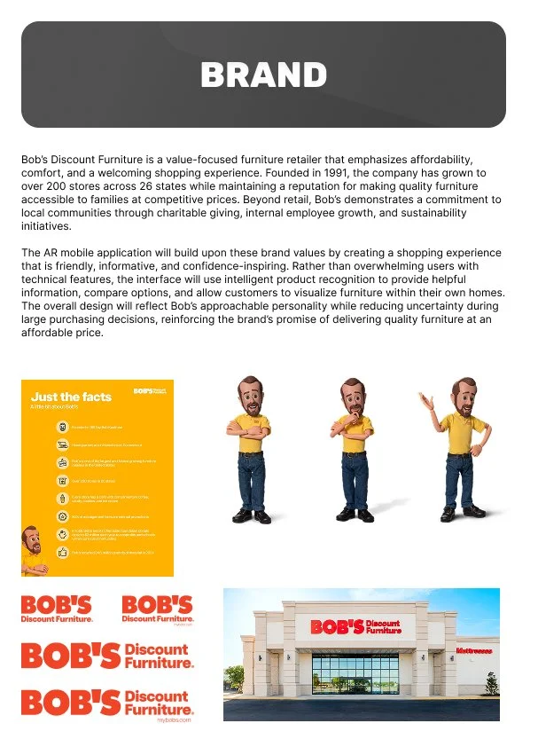
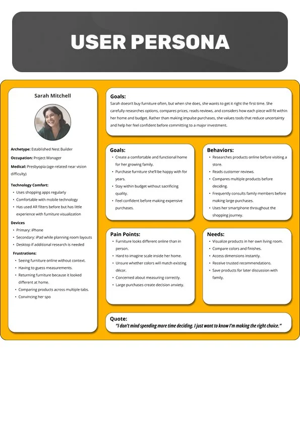
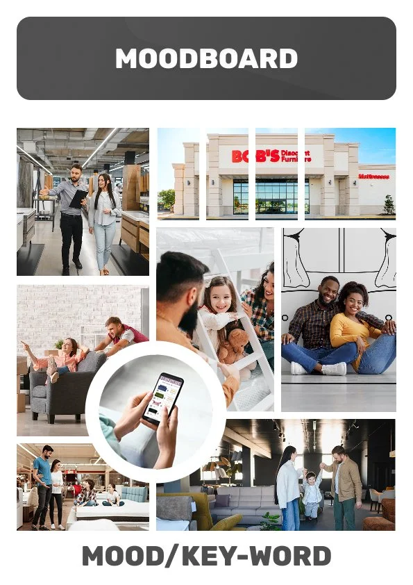
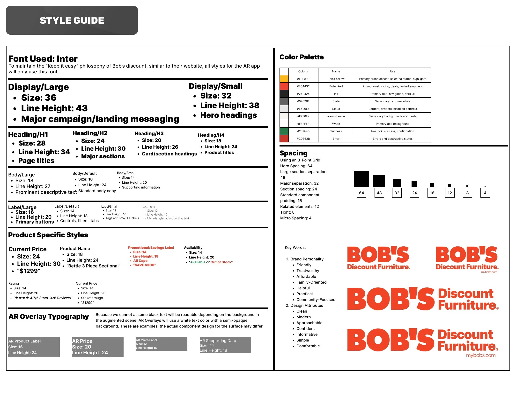
The research phase began with the existing Bob’s Discount Furniture experience. Rather than creating an unrelated AR concept and applying the Bob’s brand afterward, I examined the retailer, its visual identity, existing shopping patterns, and the information customers need while evaluating furniture. Bob’s is an established national furniture retailer with more than 200 stores across 26 states, giving the project an existing physical and digital ecosystem to design around.
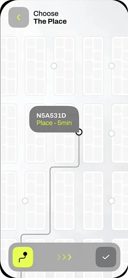
From there, I gathered interface inspiration for each of the five planned experiences and compared common patterns across mobile retail and AR applications. These references were treated as starting points rather than templates. I identified recurring interaction patterns, considered which would already be familiar to users, and looked for opportunities to maintain consistency as the experience moved between conventional mobile UI and camera-based AR interactions.
A content audit then translated that research into specific interface requirements. Instead of designing screens around appearance alone, I identified the information and controls users would need to complete each task. This included familiar retail elements such as product imagery, pricing and reviews alongside spatial features such as camera views, recognition areas, directional guidance, destinations, distance information, and controls for interacting with virtual furniture. Content auditing was specifically used during planning to determine what information users would need before moving into design.

Augmented reality was most valuable when the task involved spatial information: identifying a physical object, locating something within the showroom, or evaluating furniture inside the customer’s own environment.
Defining required information before designing the layouts helped establish hierarchy around user tasks instead of arranging elements based solely on visual preference.
Existing mobile commerce conventions provide users with recognizable patterns for search, navigation, product information, ratings, pricing, and persistent navigation. The AR functionality should extend those patterns rather than replace them.
Existing mobile commerce conventions provide users with recognizable patterns for search, navigation, product information, ratings, pricing, and persistent navigation. The AR functionality should extend those patterns rather than replace them.

Before designing the interface, I needed to understand both the existing retail experience and where augmented reality could provide meaningful value within it.
-
![]()
Brand Identity
-
![]()
User Persona
-
![]()
Moodboard
-
![]()
Style Guide
-
![]()
Inspirations
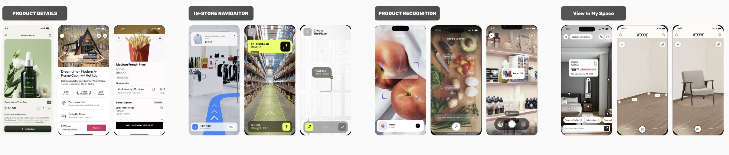
The Design Process
With the core content and functionality established, I began translating the research into a structured user experience. The first step was mapping the user flow, identifying the pages, interactions, decisions, and alternate paths a customer could encounter while moving through the experience.
The flow revealed that the five primary screens were not independent destinations. A customer might discover a product from the Home screen, encounter it physically through Product Recognition, or locate it using In-Store Navigation, but each path could eventually lead back to the same product information and visualization tools. Mapping these relationships before designing the interface helped establish a consistent navigation structure while accounting for multiple entry points and user goals.
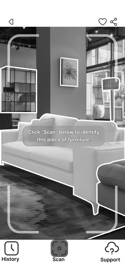
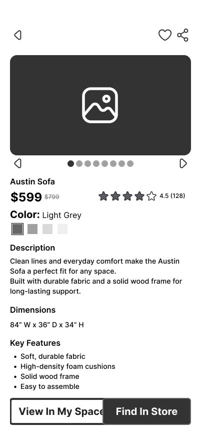
From there, I developed high-fidelity grayscale wireframes using the content audit and design research as references. Working without final color and imagery allowed the initial layouts to focus on information hierarchy, grouping, navigation, touch targets, and task completion. Actual interface copy was used wherever possible so that layout decisions reflected realistic content rather than placeholder text.
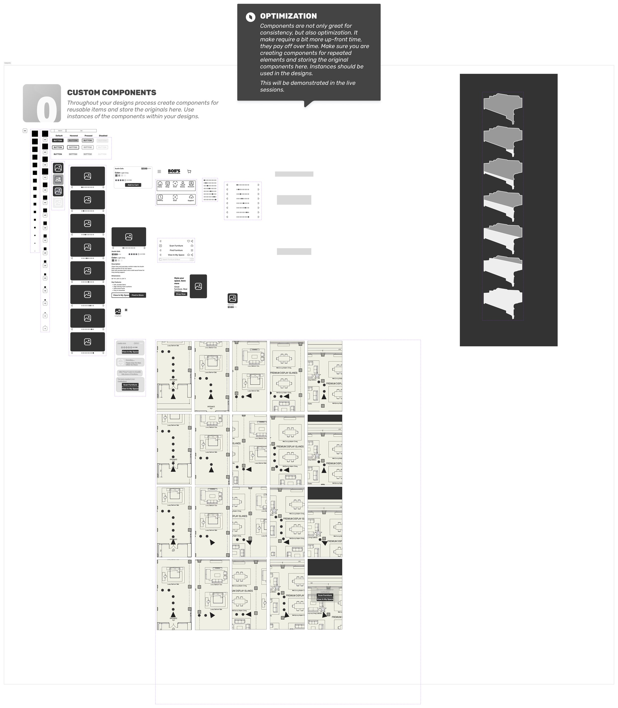
Reusable components, nested components, properties, and variants were created to establish consistent interface behavior and demonstrate a scalable design system.
Once the underlying structure was established, the wireframes evolved into production-ready mockups. Grayscale placeholders were replaced with actual imagery, realistic product information, and the established Bob’s visual language while maintaining the hierarchy and interaction patterns validated during wireframing.
The transition also provided an opportunity to refine visual hierarchy using Gestalt principles such as proximity, similarity, common region, and figure-ground relationships. Related controls and information were visually grouped, primary actions were differentiated from secondary actions, and overlays were designed to remain distinguishable from complex camera imagery beneath them.
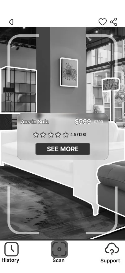
For the AR interfaces specifically, the design needed to balance environmental visibility with interface legibility. Translucent containers, strong boundaries, large controls, and limited information density allowed digital information to remain readable without unnecessarily obscuring the physical environment users were trying to understand.
Research → Flow → Wireframe → System → Mockup → Accessibility → Prototype
Once the underlying structure was established, the wireframes evolved into production-ready mockups. Grayscale placeholders were replaced with actual imagery, realistic product information, and the established Bob’s visual language while maintaining the hierarchy and interaction patterns validated during wireframing.
The transition also provided an opportunity to refine visual hierarchy using Gestalt principles such as proximity, similarity, common region, and figure-ground relationships. Related controls and information were visually grouped, primary actions were differentiated from secondary actions, and overlays were designed to remain distinguishable from complex camera imagery beneath them.
For the AR interfaces specifically, the design needed to balance environmental visibility with interface legibility. Translucent containers, strong boundaries, large controls, and limited information density allowed digital information to remain readable without unnecessarily obscuring the physical environment users were trying to understand.
Inspiration
Component-Based Design
As the wireframes developed, reusable interface patterns were converted into components and variants. Shared navigation, buttons, icons, sizing elements, product information, and repeated controls could then be managed systematically rather than recreated independently on each screen.
Creating these reusable elements improved consistency while making iteration more efficient. Changes to shared interface patterns could propagate throughout the experience, reducing the possibility of visual or behavioral inconsistencies between screens.
Refining the Experience
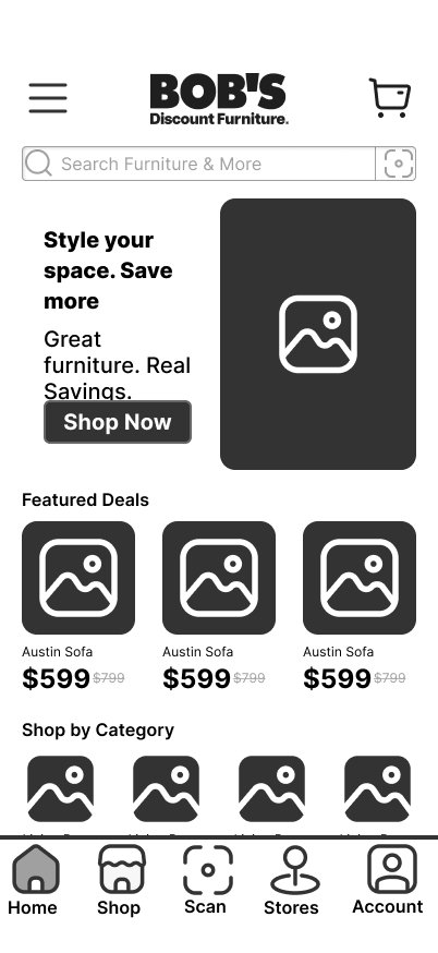
Wireframe
Iteration
Ready to Scan → Scanning → Product Identified → Continue to Product / View in My Space
Final
Designing Beyond the Visual
Accessibility was evaluated throughout the final refinement process, including contrast, typography, interactive target sizing, visual hierarchy, and the ability to understand interface states without relying exclusively on color. Final mockups were evaluated using the Stark accessibility tools, with identified issues addressed before completing the prototype.
This process reinforced accessibility as a design constraint rather than a final compliance check.
Turning research into an experience required defining not only what users would see, but how each interaction would connect across digital, physical, and augmented environments.
The Interactive Prototype
From research to interaction.
The final prototype brings the individual screens together into a connected shopping experience, allowing users to move between product discovery, detailed product information, AR product recognition, in-store navigation, and spatial visualization.
Rather than presenting the final designs only as static mockups, the interactive prototype demonstrates how the experience functions as a complete system. Explore the prototype below to experience the primary navigation and interactions designed throughout the project.
Explore the Experience
Discover → Evaluate → Recognize → Navigate → Visualize
Accessibility & Evaluation
An interface is only successful when users can perceive, understand, and interact with it. Accessibility therefore became a design constraint, not a final visual check.
The final prototype brings the individual screens together into a connected shopping experience, allowing users to move between product discovery, detailed product information, AR product recognition, in-store navigation, and spatial visualization.
Rather than presenting the final designs only as static mockups, the interactive prototype demonstrates how the experience functions as a complete system. Explore the prototype below to experience the primary navigation and interactions designed throughout the project.
Designing for More Than Color
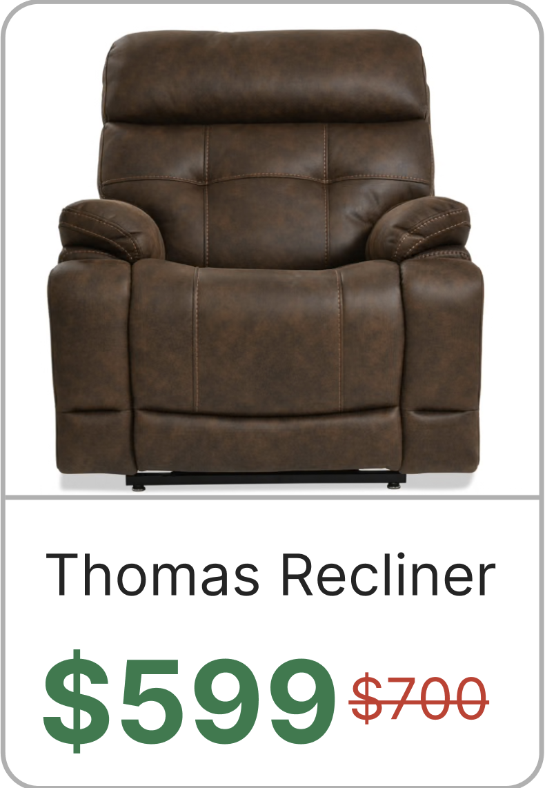
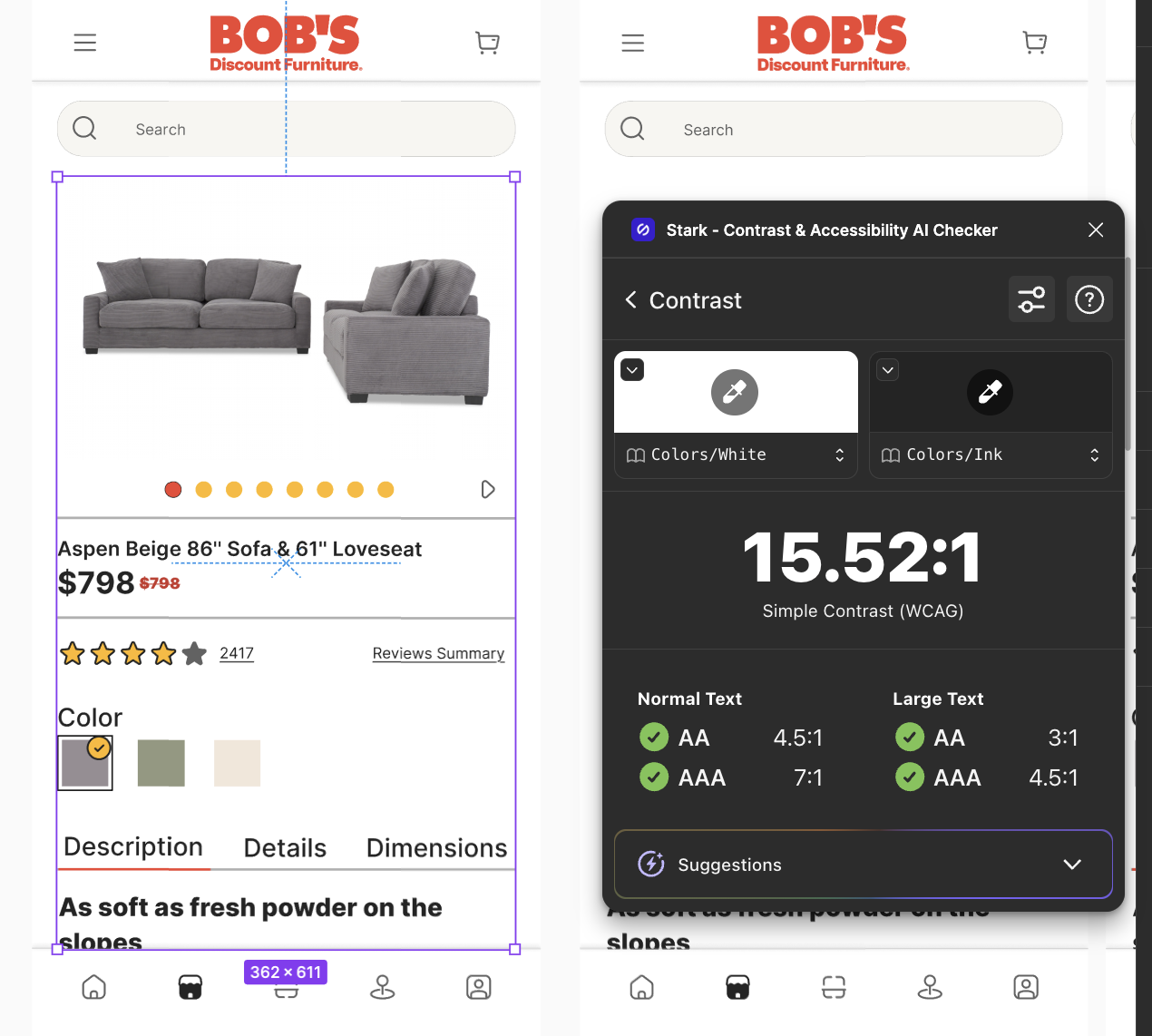
Important information and states were designed to avoid relying on color alone. Selected elements use combinations of shape, borders, checkmarks, typography, icons, and positioning so that meaning remains understandable when color differences are difficult to perceive.
For example, sale pricing combines color with typographic hierarchy and a strikethrough on the original price, while selected controls use additional visual indicators beyond a simple change in hue.
Designing for More Than Color
Important information and states were designed to avoid relying on color alone. Selected elements use combinations of shape, borders, checkmarks, typography, icons, and positioning so that meaning remains understandable when color differences are difficult to perceive.
For example, sale pricing combines color with typographic hierarchy and a strikethrough on the original price, while selected controls use additional visual indicators beyond a simple change in hue.
Testing the Final Interface
The final mockups were audited using Stark for Figma to identify potential accessibility issues and verify design decisions against measurable criteria rather than relying solely on visual judgment.
The evaluation focused on:
Color contrast between text, controls, and their backgrounds
Typography and readability
Touch-target sizing for interactive elements
Information hierarchy and grouping
Interface states that do not rely exclusively on color
Legibility of controls placed over imagery and AR camera views
Reflection & Professional Growth
The most valuable outcome of this project was not a single screen or interaction, but learning how to carry one design system across experiences that behave very differently.
This project challenged me to think beyond designing individual screens and instead consider how a complete experience changes as the user’s environment changes. Traditional mobile interfaces provide a predictable canvas, but augmented reality introduces the physical world as part of the interface. Lighting, movement, visual complexity, spatial relationships, and the user’s surroundings suddenly become variables that cannot be completely controlled by the designer.
That distinction influenced many of the decisions made throughout the project. Product browsing could rely on familiar mobile conventions, while recognition and navigation needed to prioritize the camera view and provide immediate system feedback. View In My Space required another shift, giving users enough control to manipulate a virtual object without allowing those controls to compete with the object itself. Maintaining a consistent experience across those different contexts became one of the project’s most valuable design challenges.
The structured design process also reinforced the value of establishing content, hierarchy, interaction patterns, and reusable systems before visual refinement. Moving from research and content auditing through user flows, wireframes, components, mockups, accessibility evaluation, and finally prototyping created opportunities to revisit earlier decisions as the experience became more complete.
What Worked
One of the strongest outcomes was the continuity between traditional mobile shopping and the AR interactions. Shared navigation, visual hierarchy, interface patterns, and product information allow each feature to feel like part of the same experience while still adapting to the needs of its environment.
What I Would Test Next
The next stage of the project would move beyond interface evaluation and into usability testing with participants. Of particular interest would be observing whether users understand the transition between traditional shopping and AR features without instruction, whether the recognition states provide sufficient feedback, and whether the in-store navigation system communicates direction clearly while users are moving through a physical environment.
I would also test the AR interfaces across a wider range of environmental conditions. Bright windows, low lighting, visually cluttered showrooms, similarly colored furniture, and complex home environments could all affect the readability of overlays that perform well against controlled imagery.
Finally, the manipulation controls within View In My Space would benefit from direct observation. Testing how naturally users discover and understand Move, Rotate, and Scale would help determine whether the current controls provide enough guidance or should be supplemented by gesture-based interactions, onboarding, or additional feedback.
Designing the Experience Between the Screens
This project strengthened my ability to move from an initial problem through research, information architecture, interaction design, interface development, accessibility evaluation, and prototyping while maintaining a consistent design rationale.
More importantly, it reinforced that UX decisions cannot be evaluated solely by how an interface looks in a static frame. The most interesting design questions often exist between the screens: how users know what happened, where they can go next, how the interface responds to changing contexts, and whether the system communicates enough information for them to proceed confidently.
Those are lessons I can carry beyond this project and into any interactive experience where the interface must respond to both the user and the environment around them.
The most valuable outcome of this project was not a single screen or interaction, but learning how to carry one design system across experiences that behave very differently.
Research → Structure → Interaction → Evaluation → Iteration